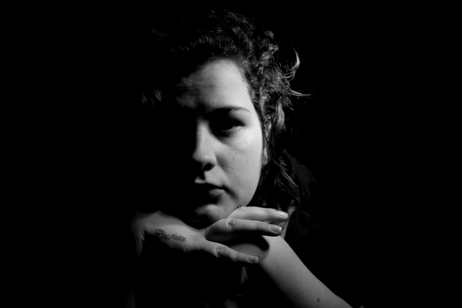
Thursday, 11 February 2016

final images

final images  
My final images produced 10 pieces that use a mix of HDR and image over laying . I really enjoyed creating these final pieces . These images are based on the human form and erotic art. but  will a finish that looks abstract and surreal.  
I think I have managed to create this really with a mix of all the areas that i planned to cover through out my planning .   
when I edited then I decided that I would want these in square and 1 rectangle for the longer face image. I then made a template on Photoshop on an A3 file using lines as a key so that each square would be 2500 on each side. This then made the images big enough to print on A3  which I will be doing when i display my final images in portfolio folder. 

image 1 : 


The two lower images are the original images these were used to then create image one which is at the top .  To do this I cropped the legs from the 1st image and placed this over the second . I then changed the opacity to 45 % so that the second image was like a faint shadow over floating . This then created my first abstract image. 

image 2 : 


This image I cropped the legs from the bottom image and then over placed this over the image of the bum and feet . I change the opacity to 45% so that you can clearly see the line sand shapes of both images , I did this because these are the key elements to identifying the form . which is the aim i was going for so who ever looks at this can use them to identify the from from the abstract/ surreal image.  

image 3 : 


This was one of my easiest images but most effective i cut both image to a rectangle shape . I then over aid these . i took the opacity of the mouth image down to 45% . I have found whilst editing that using the face images is the easiest to piece together to create a new image. 


image 4 : 


I cut out a square of the top half of the first images body to use as the base image. I then cut out a square of the bottom image using the arms face and breasts in my square. I then changed the opacity of the second image to 55% 
I found when printing this image that this was darker than the rest if I had more time I would have gone back and made it brighter so that the print quality s a clear as the digital. 


image 5 : 


I first cut a sqaure of the top part of the first image I then used this as the base image because This image at darker features that I thought would stand out through the second image. I then cut a square from the centre of the second image and places this on top . The opacity was then changed to 47%
The detail of the bodys out line i think works especially well in this image with the dark line of the base image. 


image 6 :  This I feel is one of the best images i have produced because of the way the head sits in between the arms almost like it is floating. I also like how detailed this image is and how much of a surreal aspect I feel that it shows. To make this i cut the arm part of the body of the first image into a square and turned this around. I then placed this over the head and changed the opacity to 38% Which blended the image straight into the head image . I found that when I changed the opacity that the body part of the image was erased out which then left the arm to fit into place resting on the head. 


final images (2) images 7 to 10

image 7 :


image 7 - cut image 2 to use the bum area and image 1 to use the legs and feet , I then overlaid these and changed teh opacity of teh feet to 46 % so the images blended together . 
image 8 : 


In this I cut out the leg area i then duplicated this . I then turned one of these images around so they were semitropical. I then overlaid these over the image of the handcuffs . My final step was to change the opacity to 55% so that the images blended together this made a cross effect . which I really love in this image because it follows the idea of creating shapes and changing the form.

image 9 :


I first rotated the body image 90% counter clock wise .I then duplicated this layer to then make them semitropical as they sat next to each other . then blending into one image that I then over laid over the chest image. I changed the opacity of the body layer to 55%

image 10 :


This image was one of the easiest but I think looks like one of the best . first rotated the body image 90% anti clockwise . I then put the eye image over this and changed the opacity to 45%. I then cropped the image to 2500 square to re size and shape for printing .


overall I'm really pleased with all of my final images , I think these show my  aim of showing thw human from an abstract and surreal way  just as I planned . I  also think that the way The HDR images blend really well with the raw edited images when there opacity is lowered making the 2 separate images look like they could have been cut from one original image .
The things like the most is the way that you can see the form of the body has changed and until you look closely at the pieces you can tell that that it is achully a body parts , it just looks a selection of shapes which is the aim I was going for. I wanted to do this so the viewer of the image had to work there way around the surreal image to make out the parts that have made this.
I also think that the dark tones of the monocromic high contrast hdr work really well with this because it gives the feeling of a painting and this then links to the original way in which the human form was originally sow for art.
I think that these images cover what the brief set and my idea clearly with the use of HDR nad image over laying fro my digital process , but then also with the style of old black and white image that show the changing in the body (form).
If I had time to do this again I would experiment with using more HDR images so that I had a wide range of differently exposed image to work with..

These images have been printed and handed in a portfolio folder

final shoot HDR images

final shoot HDR edited images 
These images are my final set of HDR image from photo shoot three . I used monochromatic  high contrast HDR for all of these because this is the filter that I will use for my final overlaid images. I love the way these have turned out especially the way the upping the clarity has brought out the detail and imperfections on the body. This I think will work really well  when over laid with the second image .
I chose the high contract monochromatic filter because I really like the way this makes the photographs look like painting and makes them really high contrast . This I think with the bright raw edited images will blend really well together to create an abstract piece that will keep with my idea of changing the form of the body . 
I have also made the back ground all really black so that the from of the subject stands out really brightly I have done this so the shapes and lines will stand out in when over laid with the second image.  
monocromation high contrast
gamma 0.58
exposure 0.40
detail 160
cropped image

levels 131/1.00/255
monochromatic high contrast

radius 53
strength 3.53
gamma 1.67
exposure - 1.50
detail 296
shadows 51
highlights 80
virbrance - 100
saturation -100
monochromatic high contrast
radius 273
strength 2.28
gamma 1.10
exposure -1.00
detail 256
levels : 164/0.30/250

monochromatic high contrast :

radius 378
strength 3.12
gamma 0.74
exposure -0.30
detail 248
shadow -5

monochromatic high contrast

radius 333
strength 2.73
gamma 1.00
exposure -2.90
detail 250
shadow 70
highlight 50
levels 99/0.68/244
radium : 226
strength 3.14
gamma 1.94
exposure -1.55
detail 240

levels 172 / 0.54/255
radius 393
strength 2.64
gamma 0.99
exposure -3.25
detail 258
levels 54/0.78/245
gamma 0.62
exposure -1.75
detail 236


charles bergqust

charles bergqust 
 
Charles is a director , photographer and designer from california. 


I find these images really eye catching because the bright colours jump out at you and then lead you see the subject like a floating black siloutte .  I also the the mix between what looks like the human body ( female) and nature like in florian images . but in this with the mix of colour .  
I also love the mix of colours that are used this makes the image look like clouds of powder paint have just been thrown onto the image that u think gives it an exciting feel.  
These aren't the type of images that I would produce because I use black and white but I do think these are amazing images. 
The's are different from the black and white images of florian not only.in colour but because these are edited in photos hop . I think you can see by the mix of colours and layers that they have been extensively edited in photoshop with a mix of.multiple layers . 

andrew de freitas

Andrew de freitas 


This collection of black and white images are some of my favorites I love the composition of the images and how they are either looking out into the distance or looking away as the image looks out over the land scape . This I think makes you wonder about the emotion behind the subject and where there looking to and why. 
I really like the exposure in these images and we'll and the way the light shines through the subject lighting the while.images and like in the image above showing the eyes looking into the distance . 

vivek jena

vivek jena 


web reference : https://about.me/vivekjena  

These images I think aren't as good as the others I have looked at . I think this is because  I don't think they are very well composed  and the images them self.dont flow as.easily . 
I don't like the last image with the blurr and the coloured lights this is because the image is different for the rest I have looked at and stands out .